


Erich Gherbaz
Redesigning AI interactions for SRE’s incident response clarity
Lead product designer
Agentic AI
3 months
2025
Context
As the Lead Designer on the AI SRE Team, I worked on...
Redesigning the investigation experience to improve discoverability of key sections.
Synthesizing pain points from user feedback, building trust in AI outputs, cluttered screens, and lack of visualizations.
Exploring transparency solutions by connecting investigations to their sources and surfacing AI's reasoning steps (runbook).
Collaborating with product and engineering to align redesign concepts with technical feasibility and AI model constraints.
The software
An agentic AI SRE: a generative-AI-powered tool for IT operations and DevOps.
Its goal is to reduce the time engineers spend diagnosing and troubleshooting system problems by:
Continuously monitoring telemetry (logs, metrics, alerts, etc.) from many tools and environments.
Detecting when something is going wrong (or will go wrong).
Automatically correlating across multiple signals (metrics, alerts, configuration changes, logs) to infer root causes.
Suggesting or providing actionable remediation steps to expedite the resolution.
It integrates with many existing tools, observability platforms, and incident management tools, so you don’t have to replace your current stack.
The old
Previous functionality
The problem
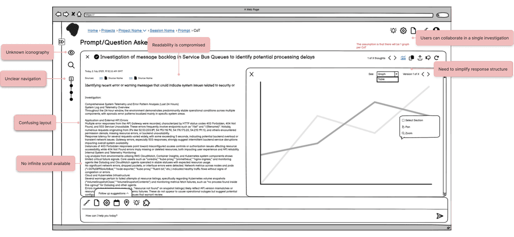
Cluttered interface and text-only responses without a clear structure
Site Reliability Engineers are responsible for diagnosing and resolving critical system incidents under time pressure. However, 4 recurring challenges in navigating the agent’s investigations were limiting trust and slowing resolution:
Discoverability issues
Key sections such as the Root Cause summary, triggering incident, and recommended resolution are hard to locate and often lack depth
Lack of transparency & control
Users cannot see how the AI’s runbook (step-by-step reasoning) is built, nor which sources were used, leading to distrust in the Root Cause Analysis.
Poor information consumption
Responses appear in multiple places simultaneously, making screens cluttered.
Context gaps
Investigations are not linked to their sources or to past, similar issues, limiting users’ ability to validate findings or learn from history.
As a result, users experience cognitive overload, reduced confidence in AI outputs, and difficulty acting on insights, which undermines the tool’s purpose of accelerating incident resolution.
Research & insights
Understanding our users: Site Reliability Engineers under pressure
Through 10+ user interviews with DevOps professionals, the research team uncovered the following key insights:

Need for Simplified Views with Optional Detail
Users find current question responses overwhelming and hard to consume. They want a cleaner, simplified default view, while still having the option to expand into a verbose or advanced version when needed.

Need for Editable AI-Generated Questions
While the AI generates useful questions, users often want to reject specific steps or make small modifications instead of accepting them as-is.

Need for Clear and Visualized Analysis
Users struggle to quickly understand where to focus when reading the analysis. They want clearer entry points, such as graphs or tables, to make information easier to scan and interpret.
Process
Deconstruct → Redesign → Prototype
We started with a functional tool and an existing design system, but the complexity of the agent’s investigations made the UX difficult to follow. Each prompt could generate multiple investigations, each with its own summary, plus an overall summary on top. Users struggled to navigate this layered timeline and runbook behavior.
Since I was new to the project, my first step was breaking the tool down in Balsamiq to understand every function and explore ways to simplify tasks. Layouts shifted significantly as I experimented with different flows. Once the solution was clear, I moved into high-fidelity Figma prototypes, which helped the team visualize the ideal behaviour instead of interpreting wireframes.
This iterative process (low-fi for exploration, hi-fi for clarity) made collaboration smoother, accelerated engineering delivery, and ensured user feedback could directly shape improvements.
I learned that while low-fi is invaluable for thinking through complexity, polished prototypes are essential for alignment, efficiency, and building confidence across the team.
Iterations
Break it down
Solution
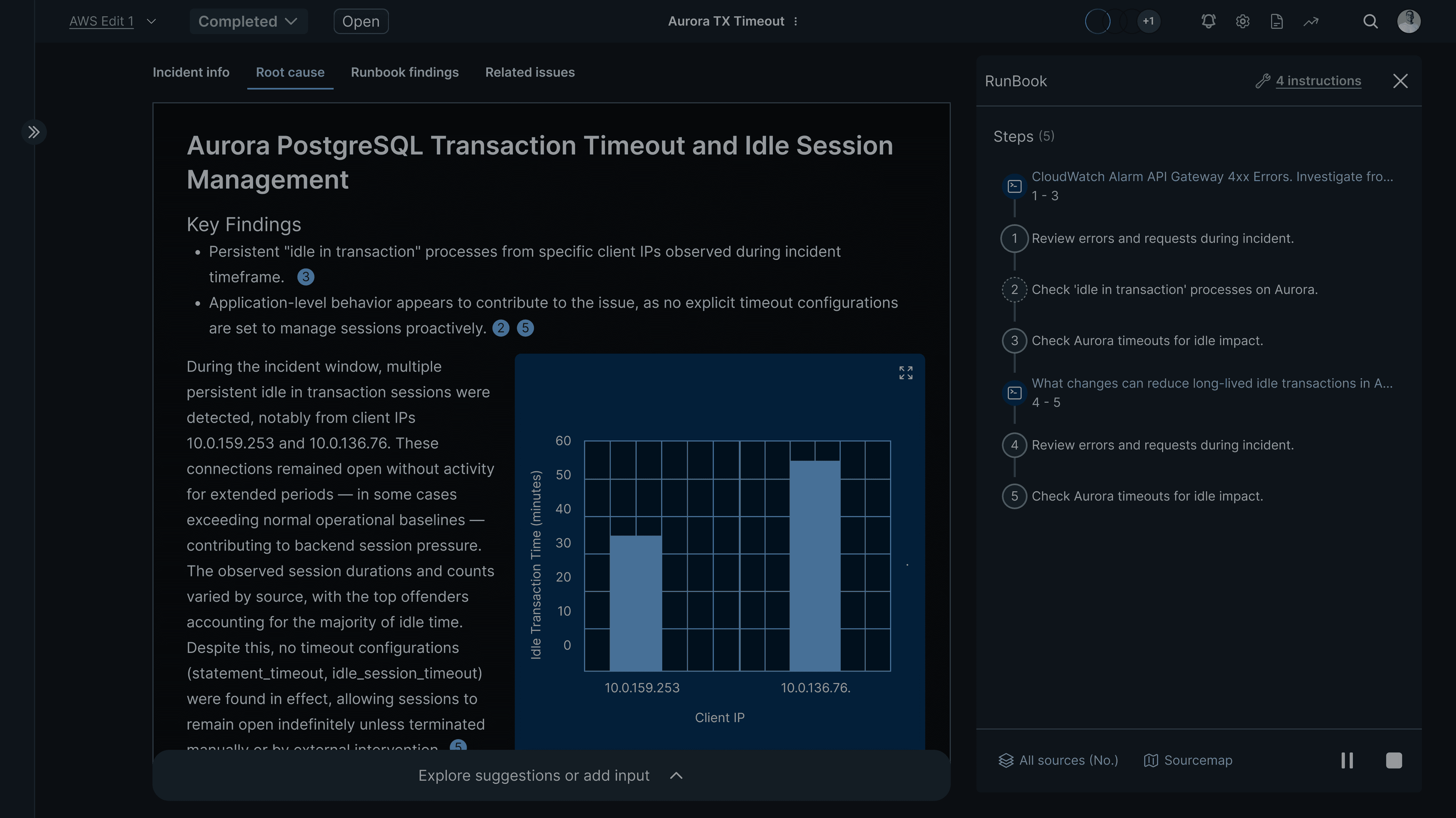
Simplifying data consumption
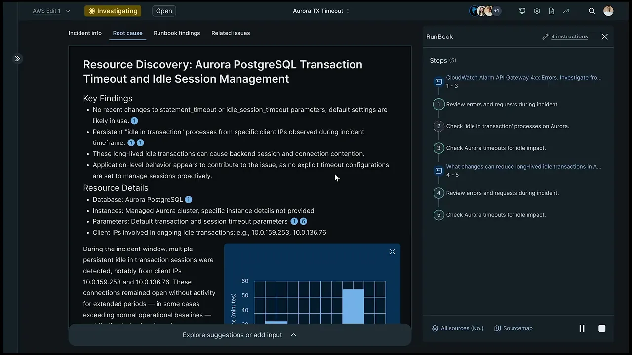
Our solution introduces a neat interface that aligns with familiar UX/UI standards from AI tools such as ChatGPT, Perplexity, and Elicit. The goal is to reduce clutter, establish a clear navigational flow across sessions, and make responses easier to consume.
A new Runbook side panel gives users control over how the AI approaches a query. This panel displays the steps (CoTs) the AI will follow. Once all CoTs are completed, the panel collapses automatically, leaving a clean workspace with the final answer. Users can also hover over the timeline component to view summaries or check the status of in-progress CoTs.
Results
Final design and functionality
Key design decisions
Defining the best solutions

Redefined the navigation
Took the key elements of the layout and gave them more importance by incorporating a tab based navigation of the investigation’s different sections.

Gave clarity to the timeline
Due to system limitations, infinite scroll cannot be applied. Instead, I worked on giving meaning to the steps timeline, allowing users to navigate with it while also understanding what took place.

Gave structure to responses
Established a clear hierarchy between titles and key details of a particular investigation, so that users can focus on what is important.

Thoughts interaction
Established an interactive pattern for the Runbook through which users can have a decision on what path the AI follows to answer a query.
Learnings
My takeaways from this project, until today...
This project challenged me to design patterns of interaction between the user and AI that are new in our field. Discovering how to tackle this task was a rewarding journey for me.
What I did:
Prioritized known patterns of interaction and current industry standards, but also tried to create a new pattern for this specialized tool. However, it is always great to see how the basics of this profession can always be useful, even with new paradigm tools.
One thing you guys are definitely doing well is the user interface. Resolve.ai definitely has done a good job on the ai and agents but they are way short on the UI compared to you.
Customer
Find me also on